
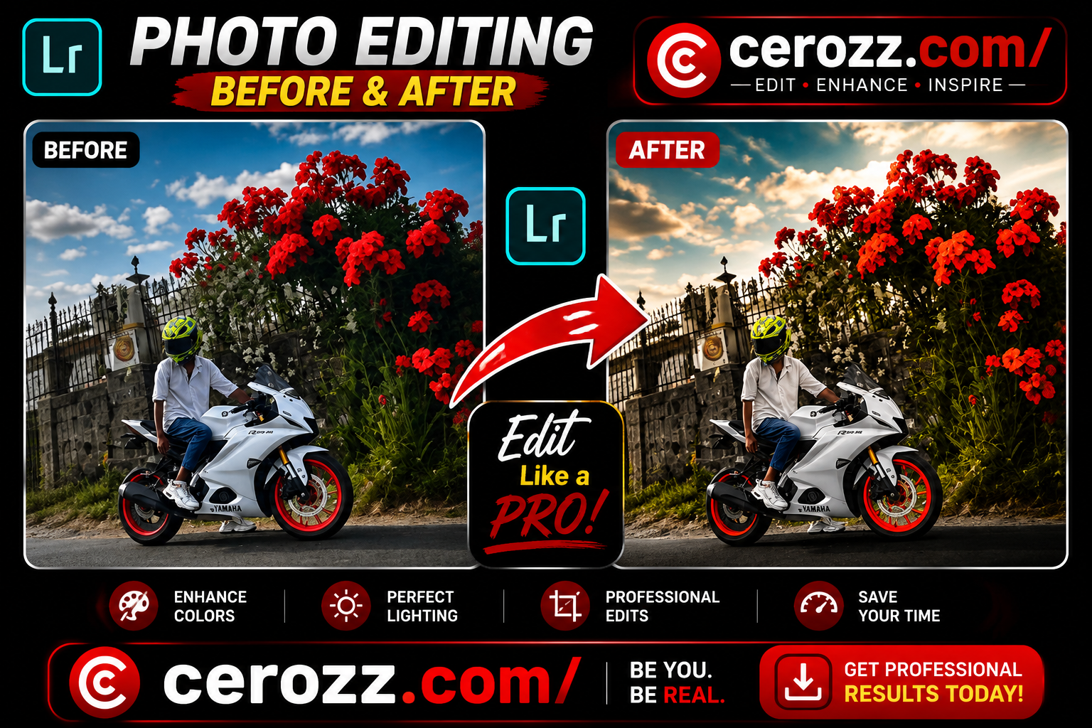
Let me be honest with you – there’s something magical about a photo where one color pops while everything else fades into the background. It’s like the image is telling you exactly where to look. And that’s exactly what this Lightroom Red Flower edit does.
In today’s world, where everyone is scrolling through hundreds of photos every day, you need something that stops the thumb. This editing technique does exactly that. It makes your subject – whether it’s a person, a motorcycle, or a flower – stand out in the most beautiful way.
I’ve been using Lightroom for years now, and I can tell you that this style has become one of my absolute favorites. It’s dramatic, it’s professional, and honestly, it’s not that hard to achieve once you understand the basic principles.
Why Lightroom Is Perfect for Photo Editing
Adobe Lightroom has become my go-to editing tool, and for good reason. Let me tell you why I love it:
Powerful Color Control
The ability to control colors individually is what makes Lightroom special. You can boost reds while toning down everything else. It’s like having complete control over every color in your image.
Professional-Grade Tools
You get access to tools that professional photographers use. But here’s the best part – you don’t need years of experience to use them effectively.
Works with Any Device
Whether you’re editing photos from a high-end DSLR or your smartphone, Lightroom handles everything beautifully.
Consistent Results
Once you master the settings, you can create consistent edits across all your photos. Your Instagram feed will look cohesive and professional.
One-Click Presets
Create your own presets and apply them to other photos with just one click. This saves so much time.
Understanding the Red Flower Editing Style
Let me break down what makes this style so special:
The Dramatic Contrast
The main subject stays sharp and colorful while the background becomes soft and slightly desaturated. This contrast is what makes the image eye-catching.
Attention-Grabbing Colors
The red flowers become the hero of the image. They’re vibrant, detailed, and impossible to ignore.
Clean and Professional Look
Despite being dramatic, the overall look is clean and polished. It doesn’t look over-edited or artificial.
Versatile Application
This style works for:
- Motorcycle and bike photos
- Nature and flower photography
- Travel and adventure shots
- Portrait photography
- Instagram reels and posts
- YouTube thumbnails
Why This Style Is Trending in 2026
Social media has changed how we think about photography. People scroll quickly, and you have just seconds to grab their attention. This style does exactly that:
Instant Visual Impact
The vibrant red flowers against a soft background immediately catch the eye. People stop scrolling and look at your photo.
Professional Look Without Complexity
You don’t need to be a professional photographer to achieve this look. The techniques are simple but the results look pro.
Higher Engagement
Photos with strong color contrast get more likes, comments, and shares. People love dramatic, artistic images.
Perfect for Content Creators
If you’re a content creator, this style will help your posts stand out in crowded feeds.
Step-by-Step Lightroom Editing Guide
Now let’s get into the actual editing process. I’ll walk you through everything step by step.
Step 1: Import Your Photo
Start by opening Lightroom and importing your photo. Make sure you’re working with a good quality image. The better your original photo, the better your final result will be.
Pro Tip: Try to shoot in good lighting conditions. Golden hour light works beautifully with this style.
Step 2: Basic Adjustments
Exposure: +0.20
We want to brighten the image just slightly. Not too much, just enough to make it look clean.
Contrast: +25
Adding contrast creates depth and makes the image pop. Don’t go overboard though.
Highlights: -30
Reduce highlights to avoid overexposed areas. You want to keep detail in the bright parts.
Shadows: +20
Lift the shadows slightly to reveal detail in the darker areas.
Whites: +10
Add a little brightness to the white areas for a clean look.
Blacks: -15
Crush the blacks slightly for a more dramatic feel.
Step 3: Color Adjustments – Temperature and Tint
Temperature: +8
Add a slight warmth to the image. This makes the reds look even better.
Tint: +3
Just a tiny bit of magenta to balance everything out.
Step 4: Color Adjustments – Vibrance and Saturation
Vibrance: +20
Increase vibrance to boost muted colors. This makes everything look richer.
Saturation: -5
Reduce overall saturation slightly. This creates the subtle desaturation we want in the background.
Step 5: HSL Panel – The Most Important Part
This is where the real magic happens. Let’s focus on the red color specifically:
Red Hue: 0
Keep the red hue natural. You don’t want it shifting to orange or pink.
Red Saturation: +60
This is the key setting. Increasing red saturation makes the flowers pop beautifully.
Red Luminance: +30
Making the reds brighter adds to the dramatic effect.
Step 6: HSL Panel – Other Colors
Now we want to tone down other colors to create that subtle background effect:
Green Saturation: -40
Reduce green saturation significantly. This makes the foliage less distracting.
Green Luminance: -20
Darken the greens slightly for a more moody feel.
Yellow Saturation: -30
Reduce yellow saturation for a cleaner look.
Blue Saturation: -50
Tone down blue saturation significantly. This helps the warm tones dominate.
Orange Saturation: -20
Reduce orange saturation to keep the focus on red.
Step 7: Clarity and Texture
Clarity: +15
Add clarity to make details stand out. This is especially important for the subject.
Texture: +10
Enhance texture slightly for a more detailed look.
Dehaze: +5
Just a small amount of dehaze to add depth.
Step 8: Local Adjustments – The Subject Mask
Now we’re going to make the subject stand out even more:
- Use the brush tool to paint over your subject
- Add clarity: +20
- Add sharpness: +15
- Slightly increase exposure: +0.10
Step 9: Local Adjustments – The Background Mask
We want to soften the background:
- Use the brush tool to paint the background
- Reduce clarity: -20
- Add blur: +15
- Slightly reduce contrast: -10
Step 10: Final Touches
Grain: +5
Add a tiny amount of grain for a cinematic feel.
Vignette: -10
Add a subtle vignette to draw attention to the center of the image.
Pro Tips for Better Results
Start with Good Lighting
The best edits start with good photos. Try to shoot during golden hour or in soft, even lighting.
Don’t Over-Edit
It’s easy to get carried away with the saturation. Less is often more. The goal is to enhance, not transform completely.
Save Your Presets
Once you achieve a look you love, save it as a preset. This way you can apply it to other photos in seconds.
Practice Different Variations
Try this style with different subjects and lighting conditions. You’ll learn what works best.
Use Sharp Images
Make sure your original photo is sharp and in focus. Blurry images won’t give you the same results.
Where to Use These Edited Photos
Instagram Posts and Reels
This style gets amazing engagement on Instagram. The dramatic colors stop people from scrolling.
YouTube Thumbnails
YouTube creators love this look for thumbnails. It grabs attention and gets more clicks.
Facebook Posts
This editing style works great for Facebook too. The visual impact is strong on all platforms.
Personal Photo Albums
Transform your personal photos into professional-looking images you’ll be proud to share.
Product Photography
If you’re selling products, this style can make them look more appealing and professional.
Common Mistakes to Avoid
❌ Over-Saturating the Reds
Too much saturation makes the flowers look artificial. Keep it natural but vibrant.
❌ Ignoring the Background
Don’t forget to desaturate and soften the background properly. This is crucial for the effect.
❌ Missing the Subject Details
Make sure your subject stays sharp and clear. The contrast between sharp subject and soft background is what makes this style work.
❌ Forgetting the Final Touches
Small details like grain and vignette make a big difference in the final result.
Final Thoughts
The Lightroom Red Flower edit is one of my absolute favorite styles. It’s dramatic, professional, and surprisingly easy to achieve once you know the steps.
The key is to focus on the contrast between your subject and the background. Make those red flowers pop while everything else fades into a soft, dreamy backdrop. This creates an image that’s not just beautiful, but memorable.
Whether you’re a beginner or an experienced editor, this style is worth mastering. It works for so many different types of photos and always delivers impressive results.
So grab your camera, take some photos, and start editing. I promise you’ll love the results!